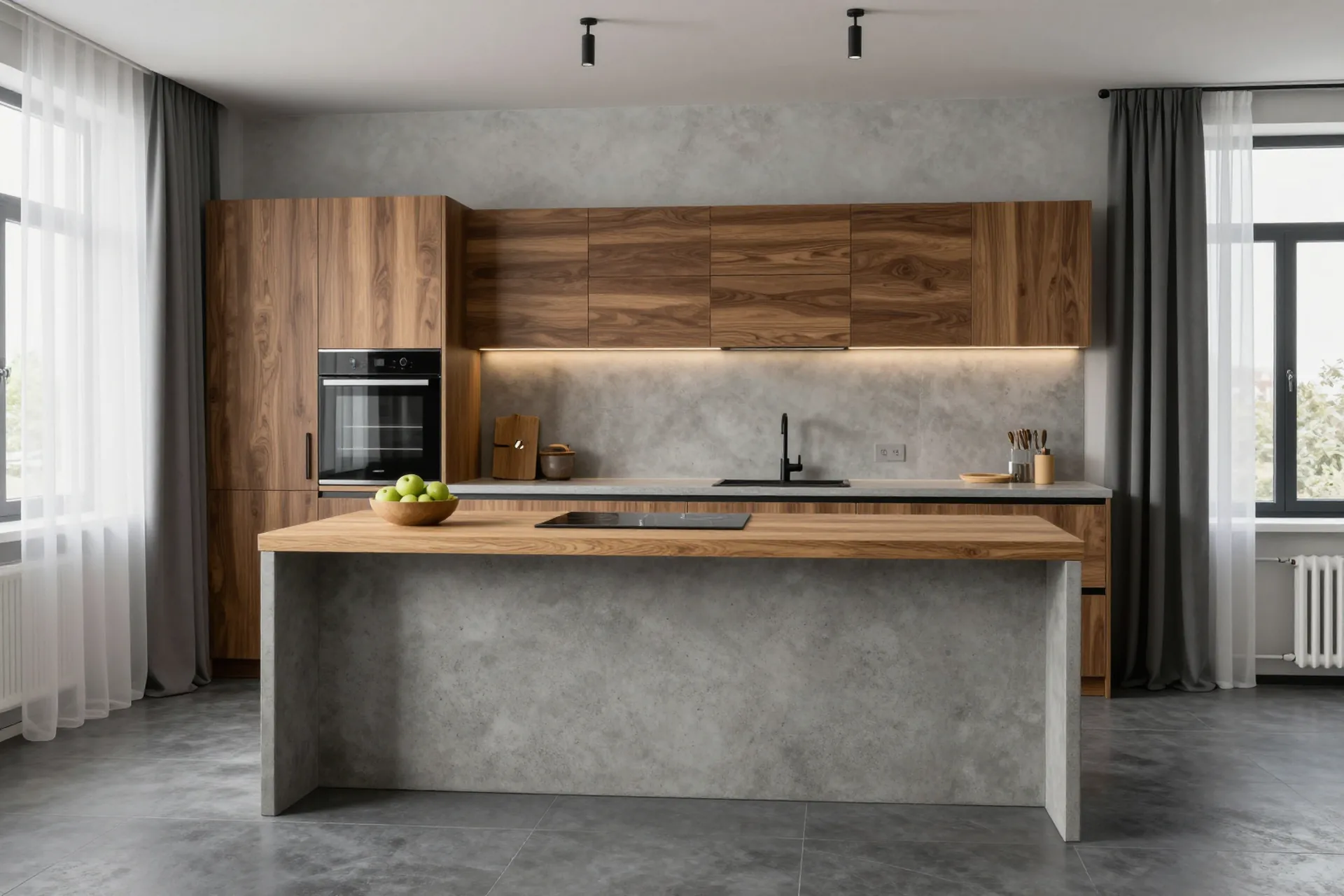
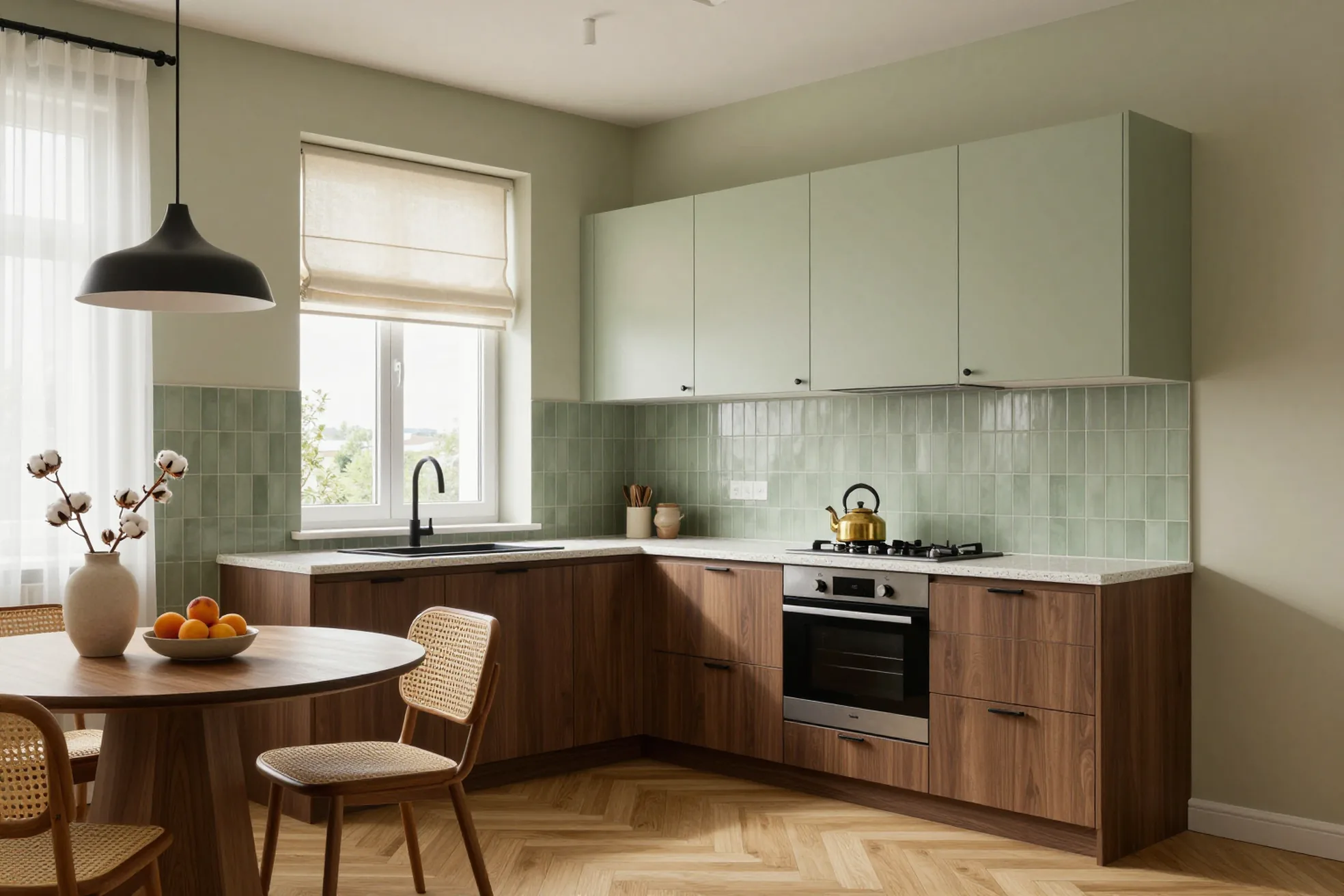
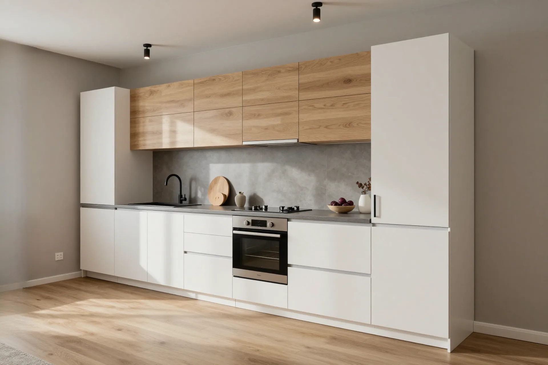
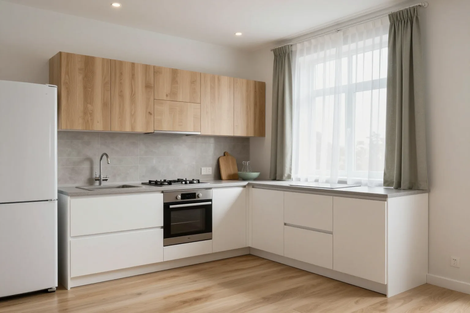
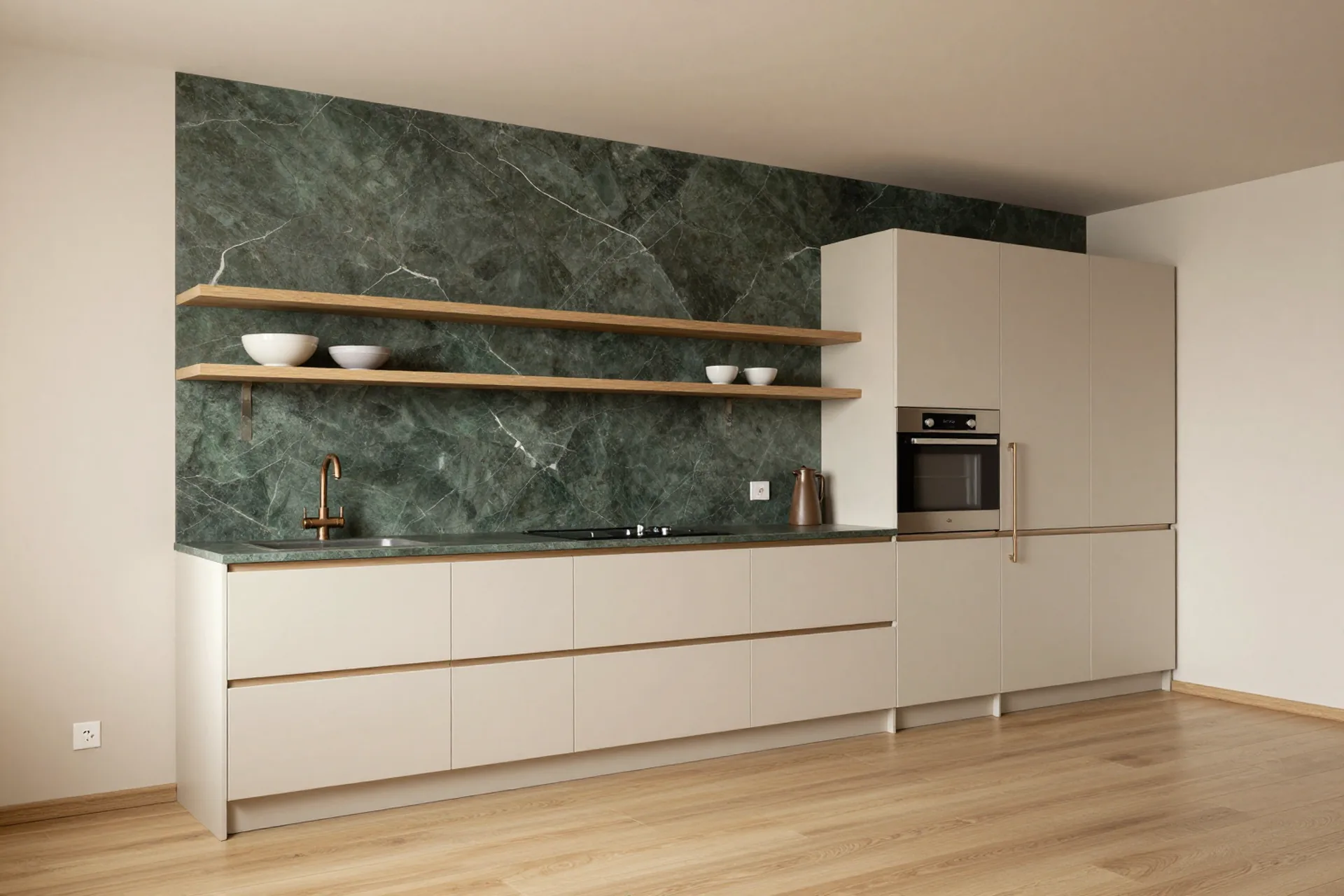
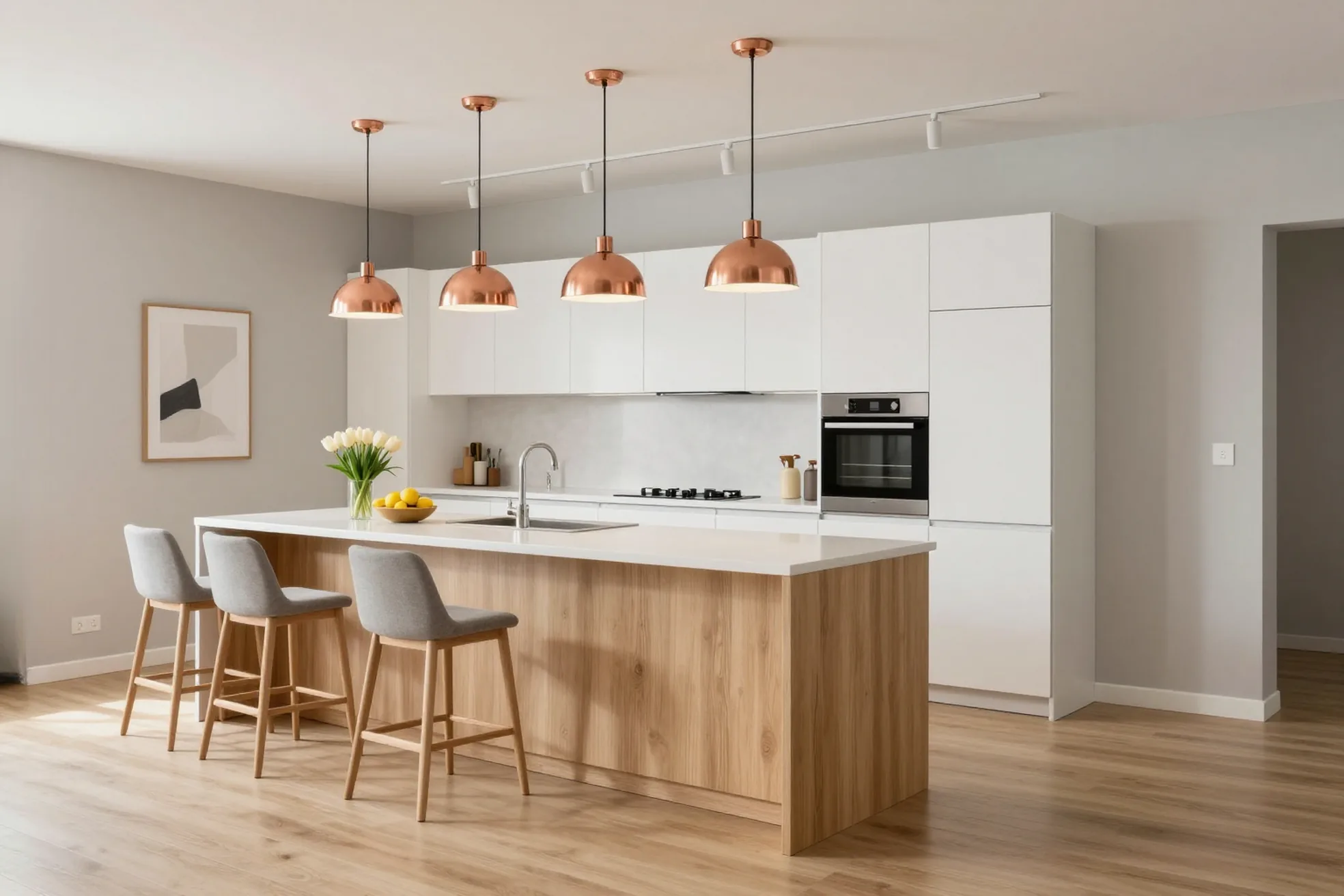
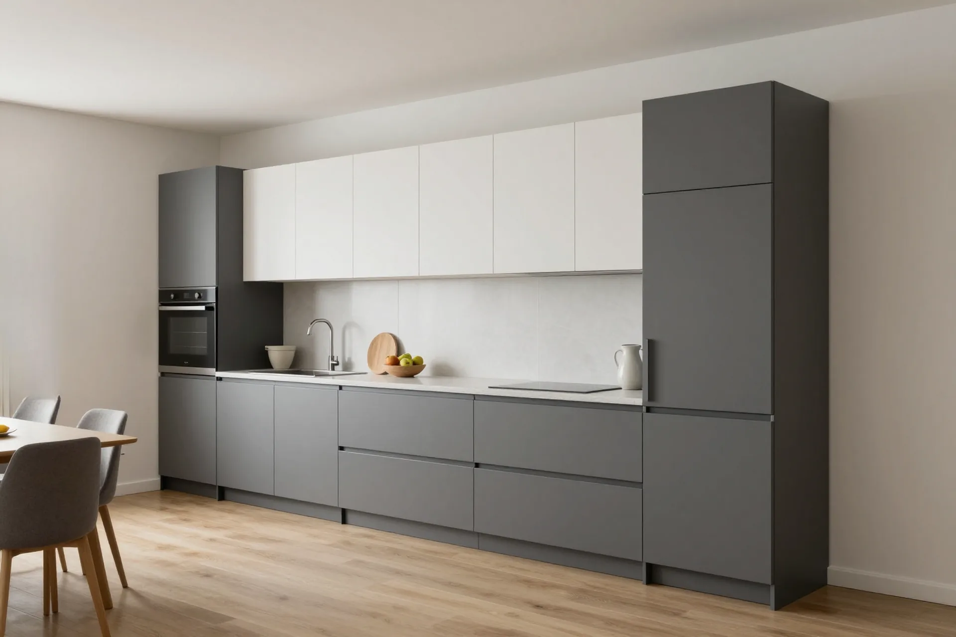
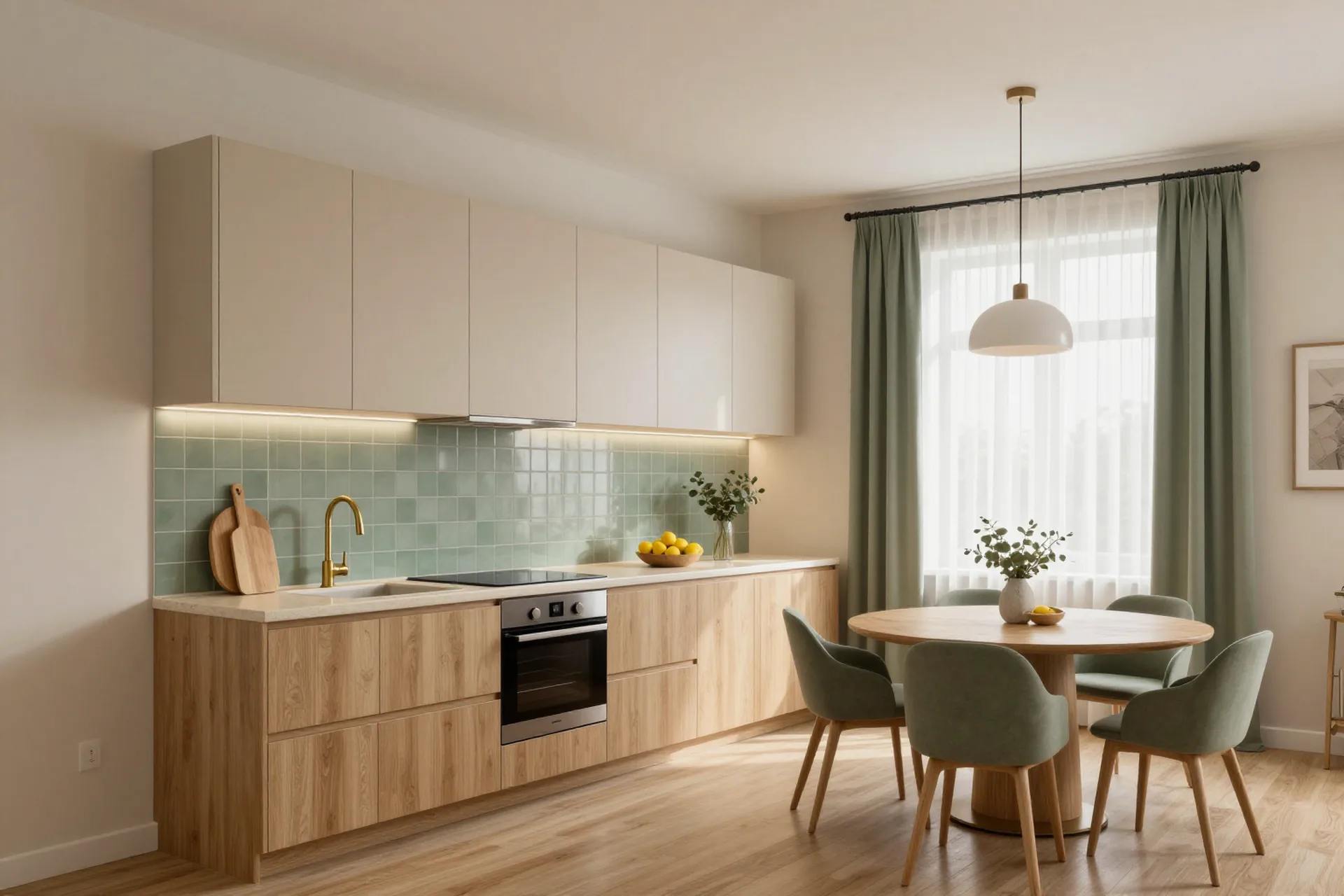
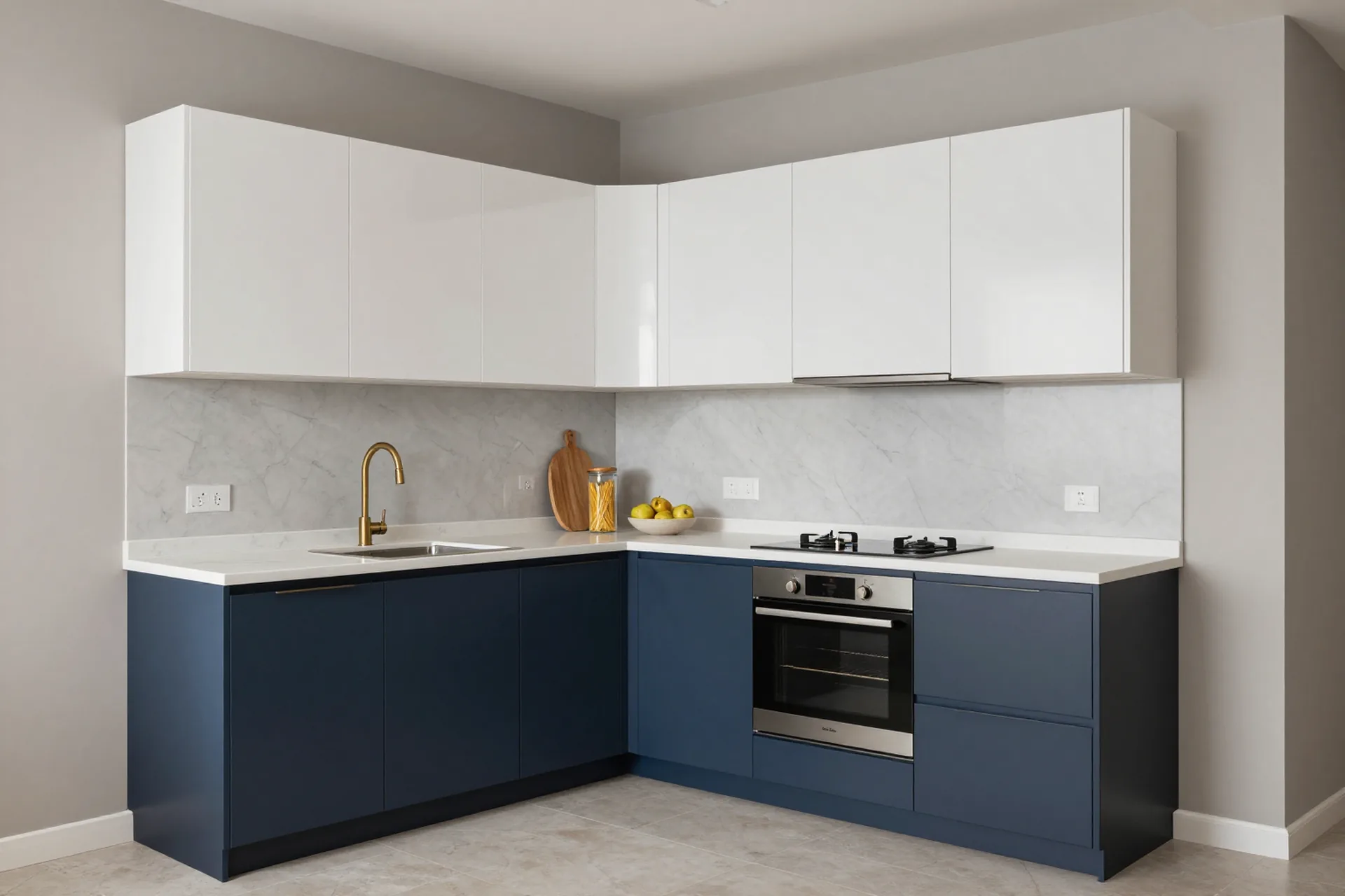
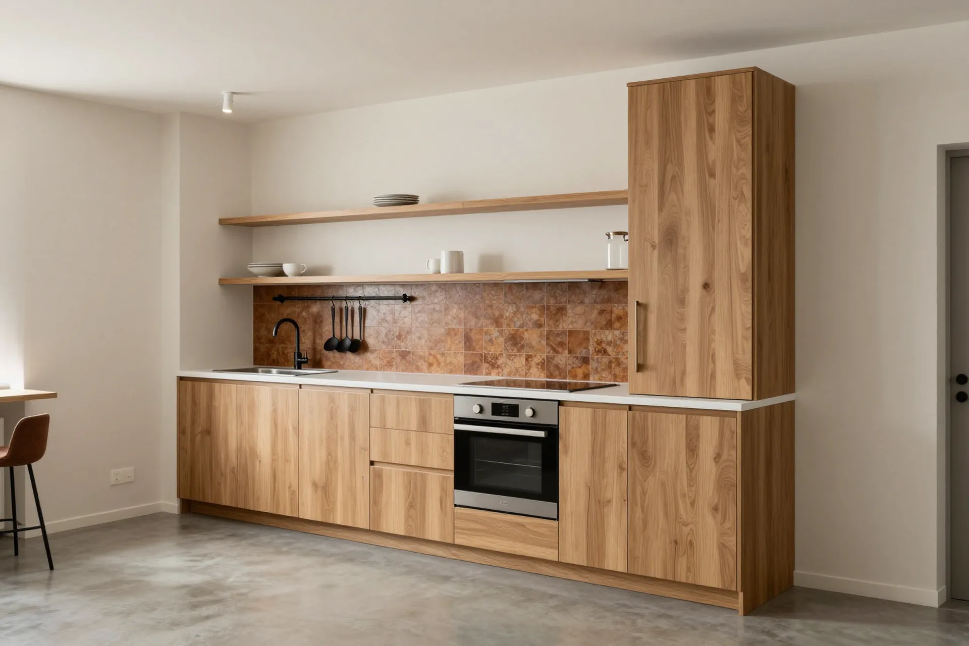
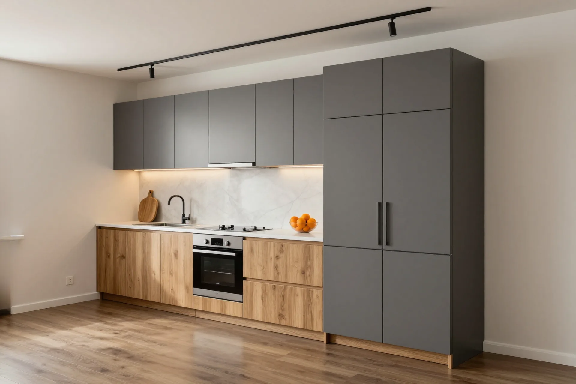
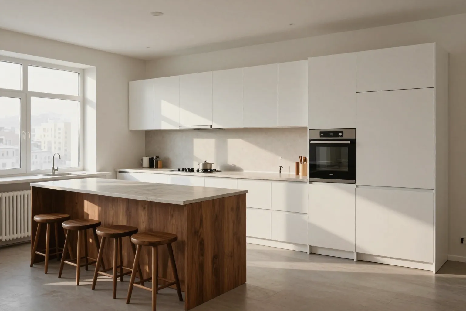
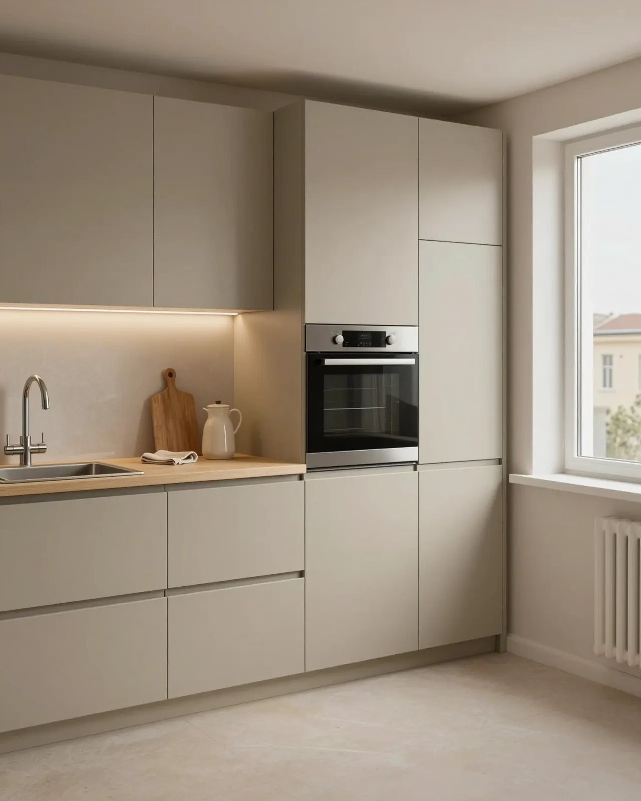
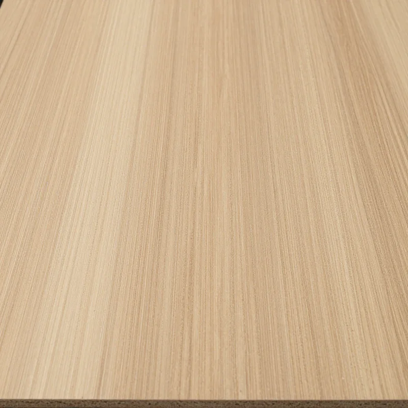
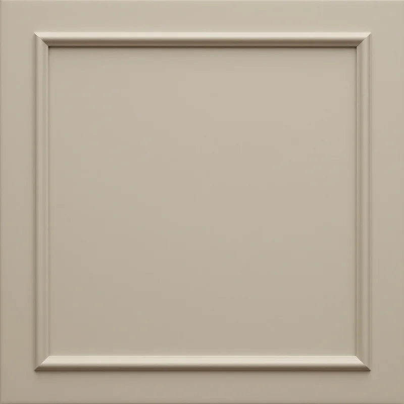
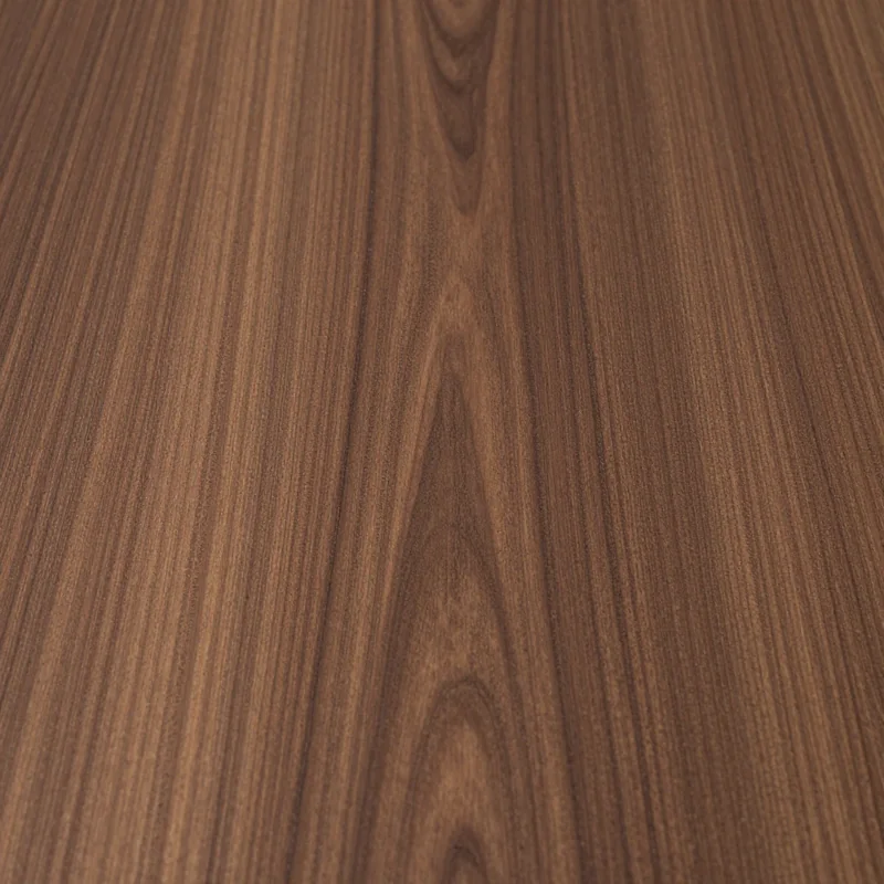
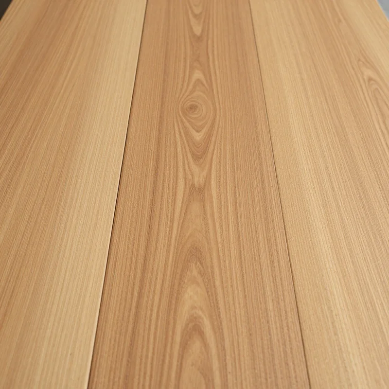
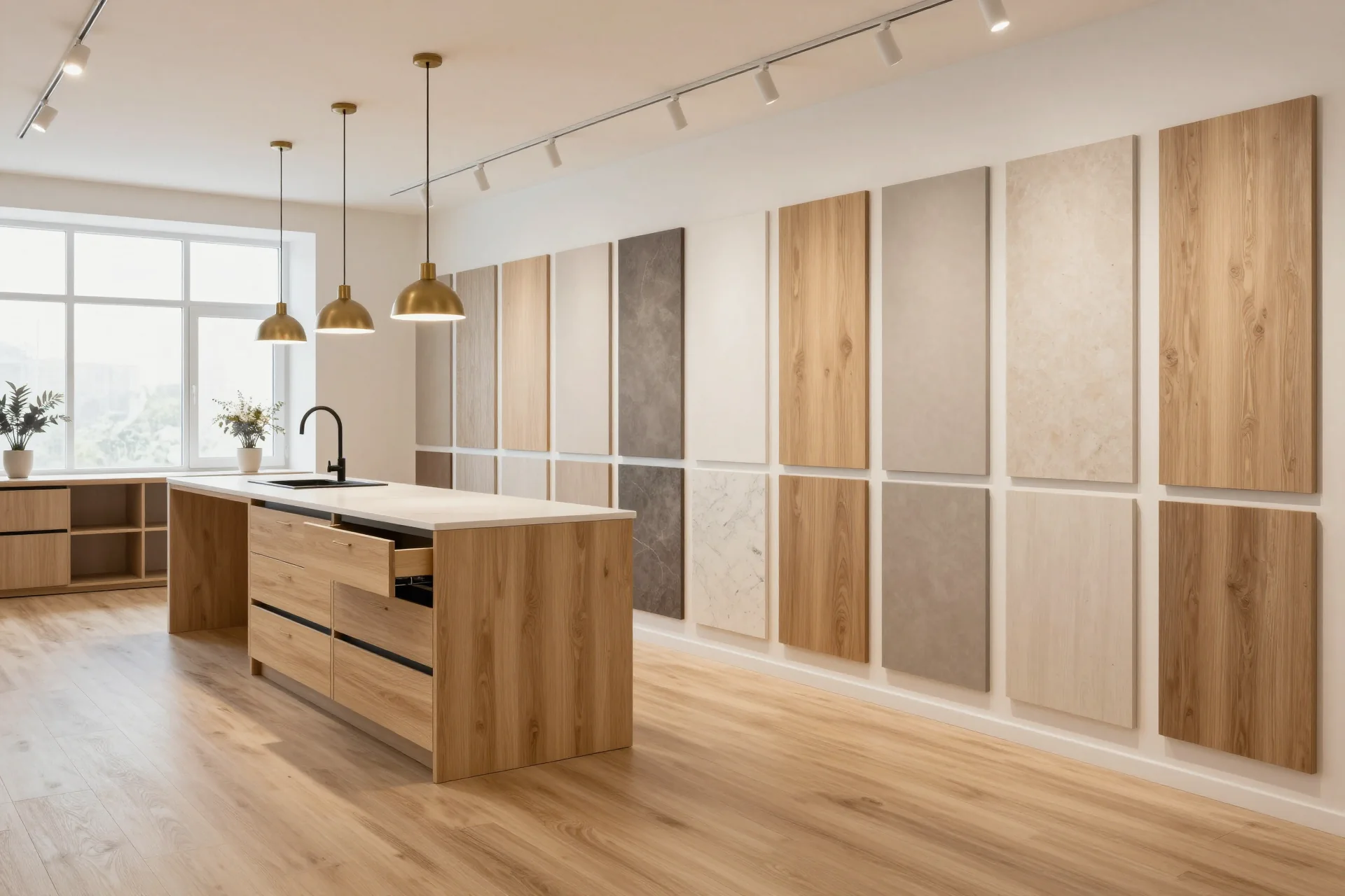
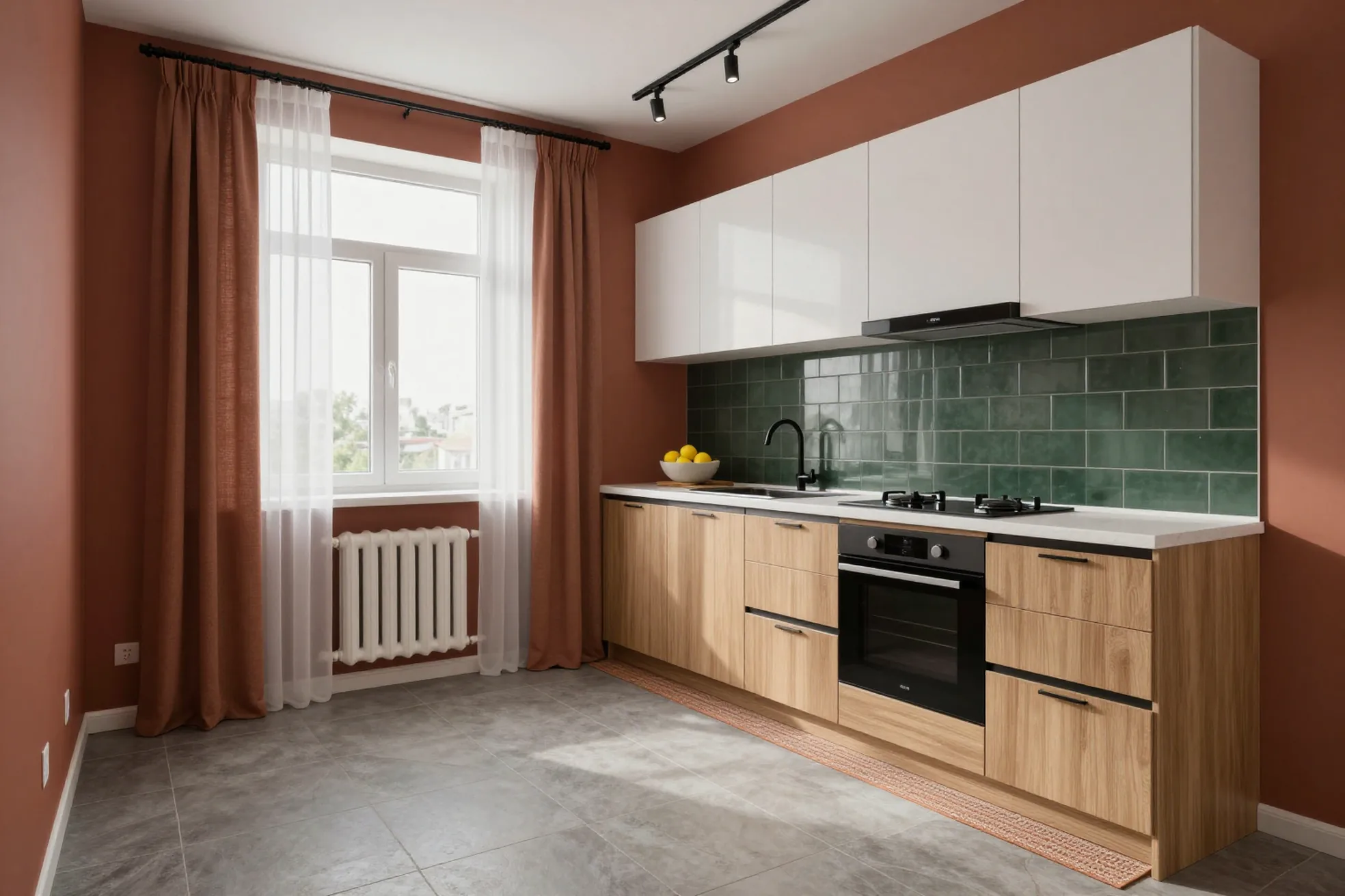
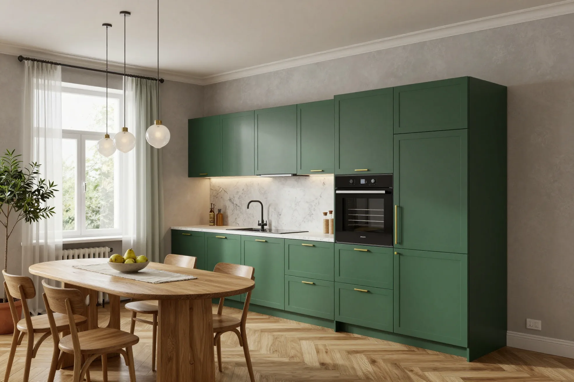
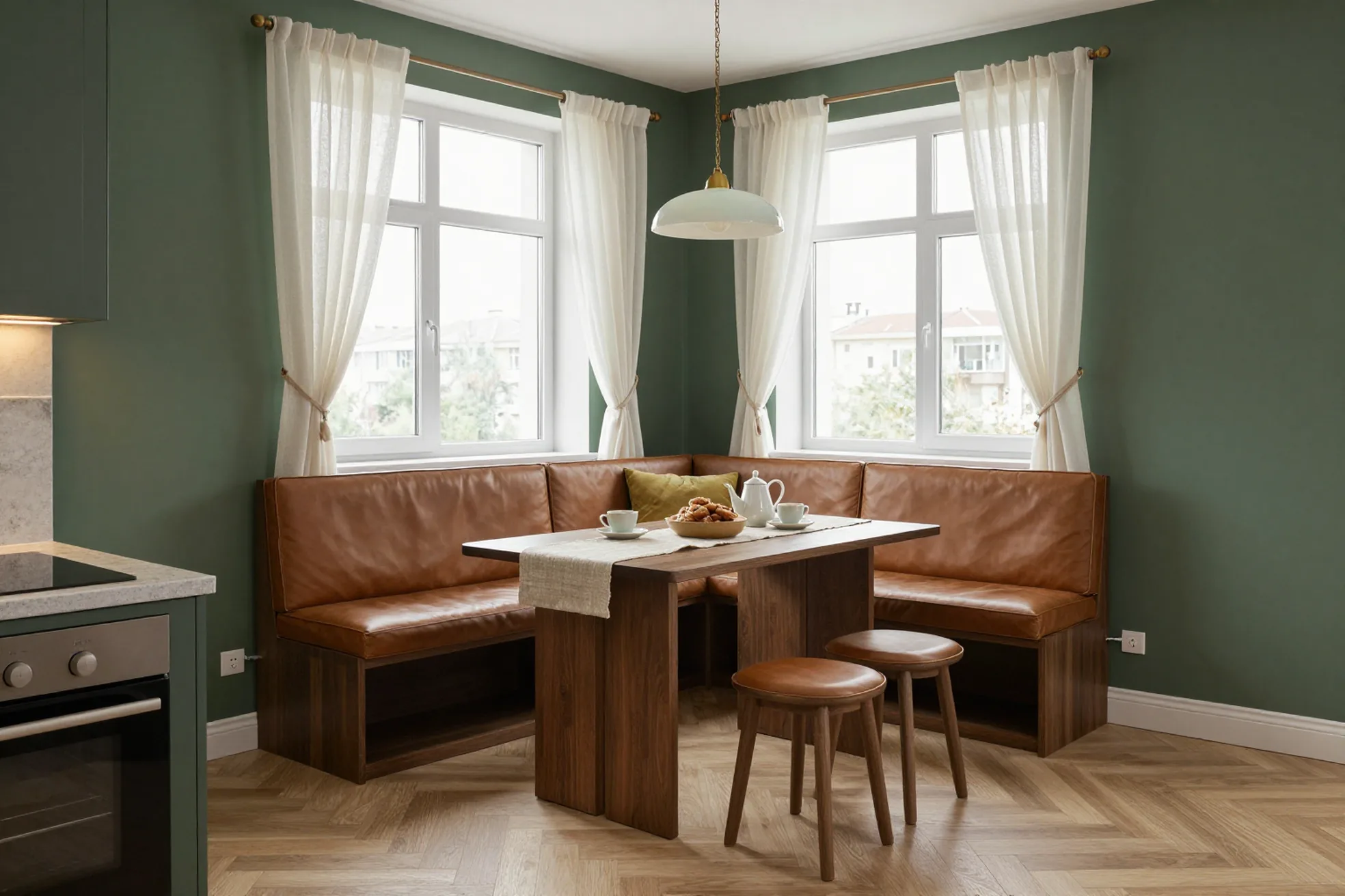
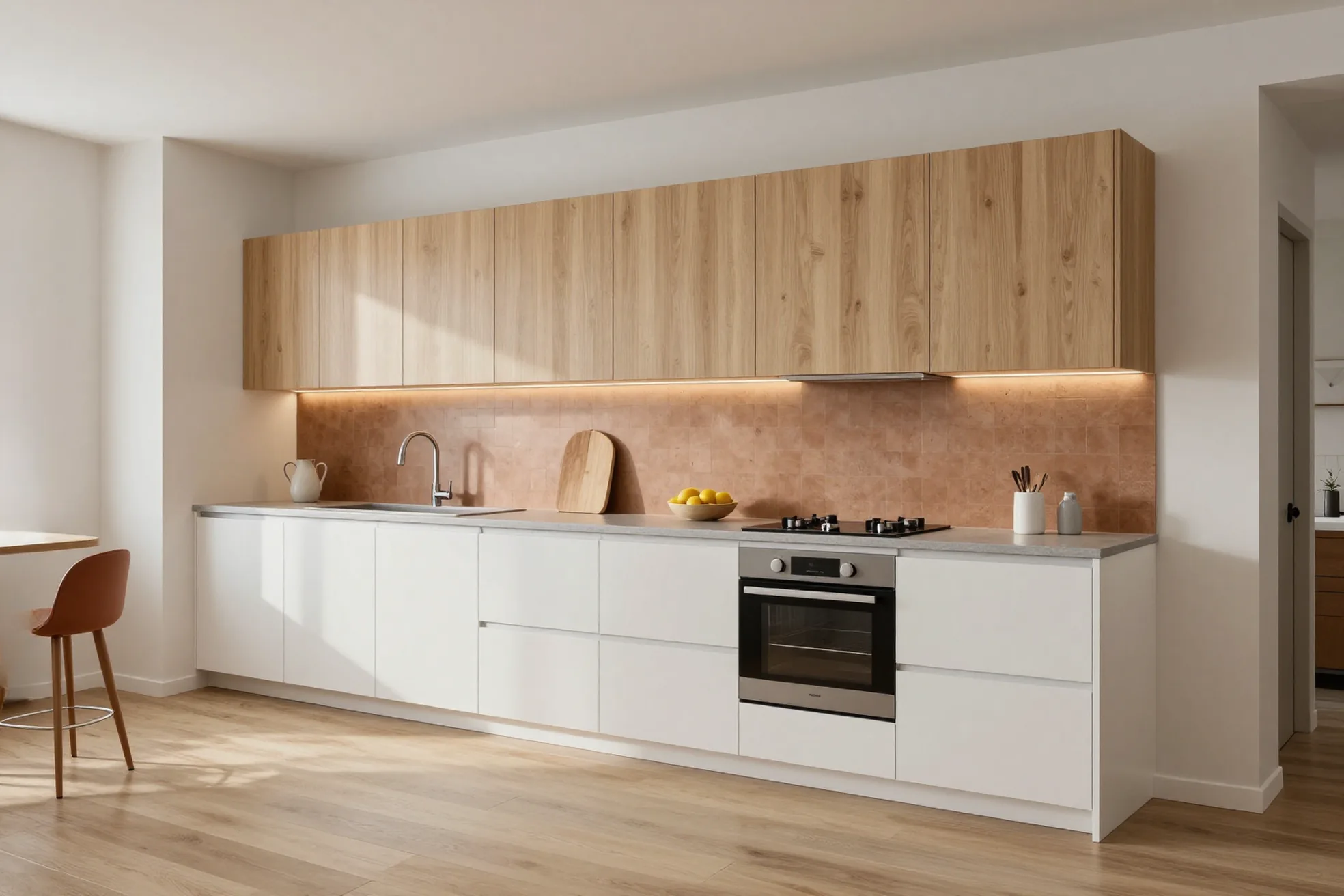
A made-to-measure two-tone kitchen is a set where the lower and upper runs, the island or the column are made in different colors or materials. Three things define a successful pairing: the light in the room, the boundary between the colors and the connecting details. We match the combination against samples under your lighting and show it in a 3D design before anything goes to the workshop.
Two colors in one set forgive fewer mistakes than one. A single-color kitchen is hard to ruin, while a combination easily turns busy — a random pair of shades, a third texture, or a boundary that cuts a front in half. Below we go through the decisions made before the measurement and at the 3D design stage: the color pair, the dividing line, material compatibility, doing without wall cabinets, connecting details and layout. Prices for each option are in the price list above on this page.
How to choose a color pair for your kitchen's light
A color pair is chosen for a specific room, not from a catalog. The same graphite looks warm gray by a south-facing window and almost black in a kitchen with a north-facing window.
The side of the compass and lamp temperature
The side of the compass changes the color of fronts more than it seems in the showroom. Noticeably more. A kitchen with north-facing windows gets diffused cold light: white drifts into gray-blue, dark blue and graphite sink into blackness. Such a room needs warm pairs — beige enamel with oak, a cream upper with a clay lower. A south-facing kitchen in Almaty is flooded with sun until evening. Here cool pairs (white with graphite, white with blue) hold up calmly, while overly warm decor starts to look yellow. In the evening everything is different. A 3000 K LED strip makes a white front creamy, 4000 K makes it neutral. That is why we hold samples against the wall twice — by day and with the lights on. The pair that works in both modes stays in the design.
Color pairs that rarely go wrong
- Graphite and warm white: a strict pair for new builds with low ceilings, the light upper blends into the wall.
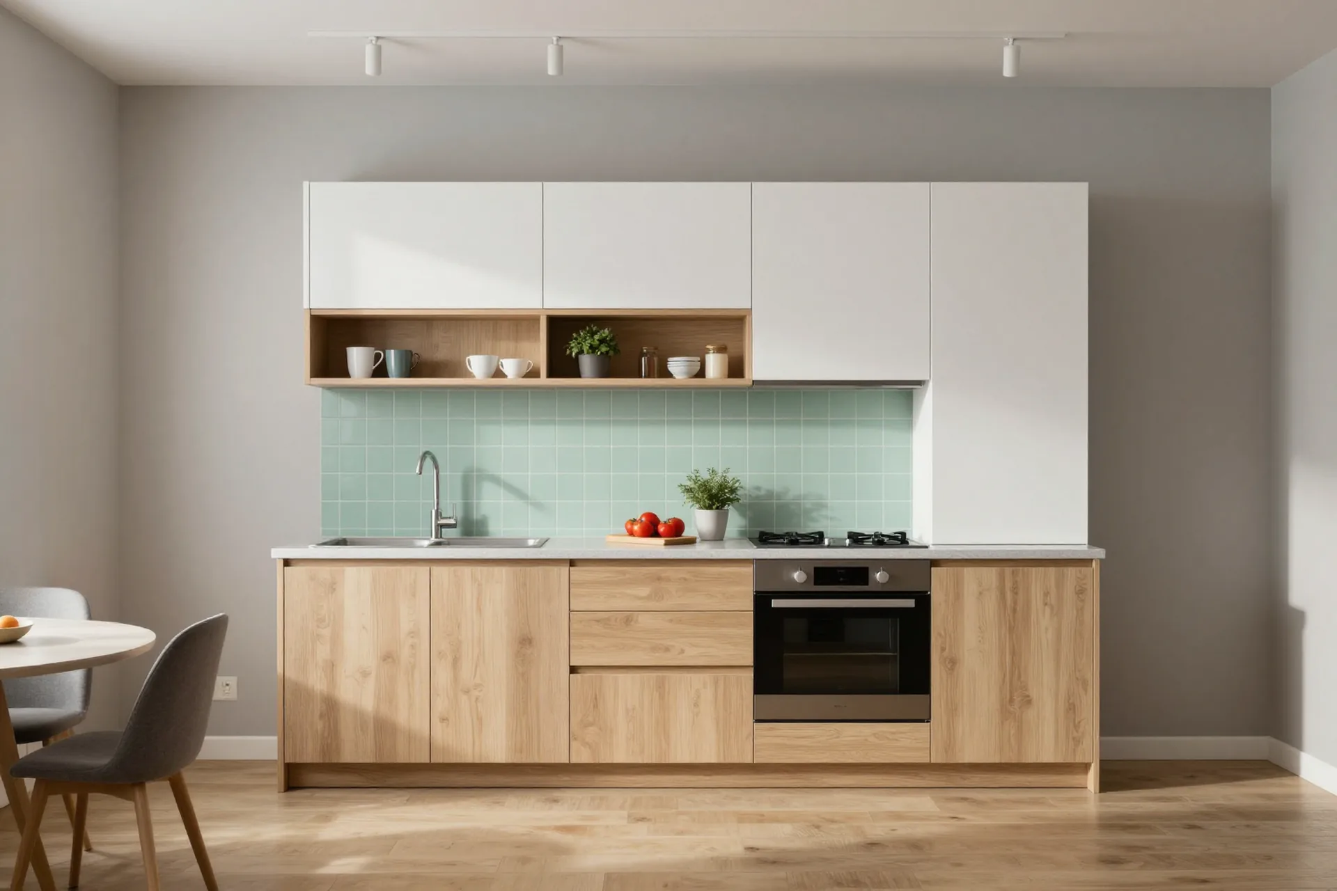
- Oak and beige enamel: a warm combination for a north-facing kitchen, the wood below doesn't show small marks.
- Dark blue and white gloss: contrast for a kitchen where the work zone is far from the window and the gloss adds light.
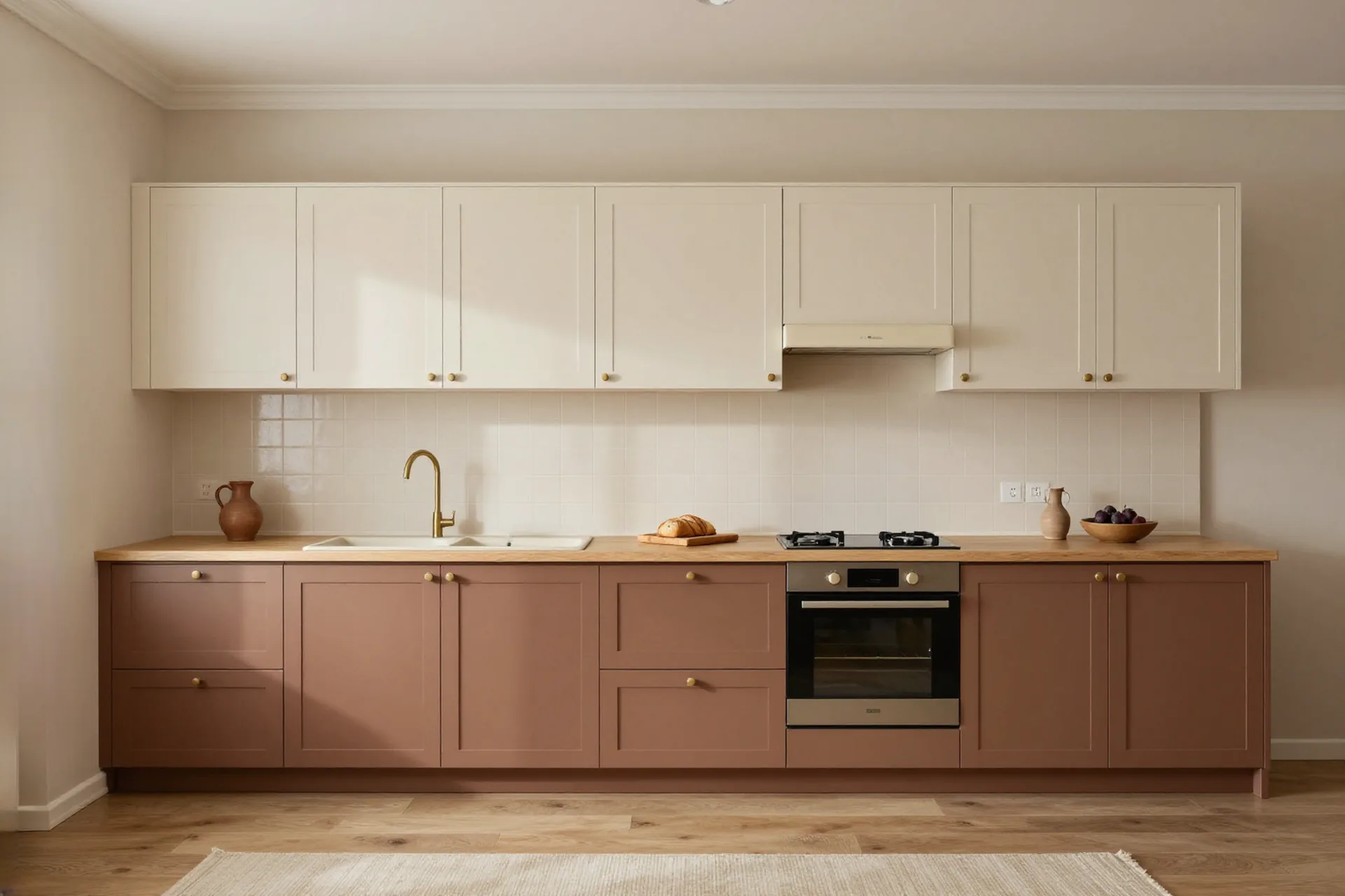
- Clay lower and cream upper: a soft pair without a sharp jump, suits parquet and warm light.
- A light set with an island in walnut: one accent in the center of the room against a calm wall of cabinets.
How to check a pair before ordering
Checking a pair takes one evening. It saves months of doubt, and sometimes the redoing of fronts that no one wants to pay for after installation. Front samples are taken at least the size of a palm — on a small square the color reads wrong. The dark sample is placed at the level of the lower run, the light one is held against the wall at the height of the wall cabinets, with a piece of countertop next to it. Look from the doorway, not up close: that is how the kitchen is seen every day. A two-tone kitchen in a 3D design shows the proportions and the color boundary, but a screen doesn't convey the exact shade, so the final word stays with the samples. If the pair raises doubts even on samples, the second color is made calmer, and the contrast is moved to the island or the column.
A color pair works when both shades have been checked on samples in daylight and evening light in that very room.
Where to draw the color boundary in a two-tone kitchen set
The color boundary should coincide with the boundary of the modules. If two colors meet in the middle of a front or at a random height, the kitchen looks assembled from leftovers.
Four ways to divide a set
Four ways to divide a set| Method | Where the boundary runs | Who it suits |
|---|
| Bottom and top | Along the countertop and backsplash | Straight and corner kitchens |
|---|
| Accent column | Along the side of a tall cabinet | Kitchens with a built-in oven column |
|---|
| Island | Around the island perimeter | Kitchen-living rooms from 15 m² |
|---|
| Wall and row | Along the end of a row of cabinets | U-shaped kitchens |
|---|
The ratio of the main color and the accent
A reliable guide is the 60/30/10 rule, which designers borrow from interiors as a whole. Sixty percent of the fronts get the main color, thirty percent the second, and ten remain for accents: handles, a shelf, a light fixture. For a 3.2 m kitchen it looks like this: the lower row and the tall cabinet in one color, the wall cabinets in another, and brass handles and an oak shelf as the accent. If the colors split the fronts exactly in half, the eye cannot tell which one is dominant (the kitchen looks busy even in a calm palette). A combined kitchen unit with a clear proportion reads as a single whole. A third front color is almost always redundant. Its role is better given to the countertop or the backsplash.
The color boundary runs along the modules, and the proportion of the main color to the second stays at around sixty to thirty.
Which materials work together in one unit
Different materials age, wash and react to the sun differently. This is taken into account before ordering, otherwise in a couple of years two rows of fronts will drift apart in shade.
How materials behave over time
How materials behave over time| Material | What changes over time | How to care for it |
|---|
| Oiled oak veneer | Darkens and warms in the sun | Refresh the oil every 5–7 years |
|---|
| Enameled MDF | Holds its color, chips possible on the edge | Wash with a soft sponge, no abrasives |
|---|
| Acrylic gloss | Fingerprints and fine scratches show | Wipe with a microfiber cloth |
|---|
| Laminated chipboard in a decor | The shade is stable, the edges fear water | Keep an eye on the edge by the sink |
|---|
| Solid oak | Darkens more than veneer | Oil and wax on schedule |
|---|
Combinations that require care
Veneer next to enamel is the most beautiful and the most demanding combination. Veneer gradually warms in the sun while enamel stays the same, so a cool white next to oak may look gray after a few years. The solution is simple. For enamel, choose a warm white or cream that does not clash with the wood even after ten years on the sunny side. Gloss next to a matte front emphasizes the difference in sheen, and this works only with a clear boundary between rows. Laminated chipboard and enamel, however, get along easily in one unit: the chipboard decor is matched to the enamel color by sample, and the difference is almost invisible. Another rule is thickness. Solid wood fronts are thicker than MDF ones, so the two rows have different gaps and overhangs — these are leveled out in the design, not during installation.
Veneer and solid wood change shade over time, enamel and laminated chipboard hold their color, and a pair for them is chosen with this difference in mind.
Kitchen units without wall cabinets and where to store dishes then
Giving up the wall row frees the wall but takes away some storage. It moves into tall cabinets and deep drawers in the lower row.
What replaces wall cabinets
- A floor-to-ceiling cabinet: one 60 cm wide column holds grains, jars and appliances that are rarely used.
- Drawers instead of shelves below: a pull-out drawer reveals everything at once, and dishes do not hide in the depths.
- An open shelf: holds what is used every day — plates, mugs, spices.
- A rail under the shelf: a ladle, a spatula and a board hang by the hob and take up no drawer space.
- A niche in the backsplash: a shallow recess in the wall for oil and salt without extra details.
What to decide before the measurement
Without an upper run in view, the extractor hood, sockets and backsplash are exposed, so their positions are decided before the measurement. The hood is chosen as a separate unit. Wall-mounted or built into the countertop, since there is no longer an upper cabinet to hide it in. The backsplash is raised higher than usual or finished up to the ceiling: an open wall gets dirty from the hob and sink just like the wall between cabinets. Sockets are moved out from under the shelves so the kettle cord does not dangle over the countertop. How much crockery will be left without a place? This is easy to calculate at the measurement: we count the wall-mounted modules you lose and show where their volume goes. If tall units do not fit, one upper cabinet is left above the hood, and the rest of the wall is freed up.
A kitchen without upper cabinets works when the volume of the upper run is moved into tall units and lower-row drawers in advance.
Countertop, handles and light as a link between two colours
Two facade colours are tied together by details that run through both runs. Without them, the lower and upper sections look like two different kitchen sets.
Countertop and backsplash
The countertop sits right on the boundary between the two colours and decides whether it separates or connects them. If the countertop repeats the shade of the upper run, the lower section remains a separate accent. If it is closer to the lower run, the kitchen visually gains weight and the upper section floats. The calmest option is a neutral stone or quartz that contains shades of both colours. The same goes for the backsplash. Plain tiles in the colour of the upper run extend it downwards, while patterned tiles bring both palettes together in one strip. A combined kitchen set made of wood and enamel handles a light stone countertop well: wood below, a light band in the middle, enamel above. The main thing is not to add a third bright colour to the countertop when the facades are already two-tone. That is too much.
Handles, plinth and lighting
- Handles in one metal on both runs: brass, black metal or a handleless profile tie the lower and upper sections together.
- Plinth in the colour of the lower run: a light plinth under a dark lower section detaches the kitchen set from the floor.
- Lighting under the upper cabinets: the strip lights the work area and makes the colour boundary softer.
- End panels in the main colour: on the tall unit and the outer cabinets, the end repeats the main colour of the kitchen set.
Walls and floor next to the kitchen set
Walls and floor belong to the same palette as the facades, although they are often chosen separately. A light upper run blends into the wall only when the shades are close: a warm white facade on a cool white wall looks yellow. That is why wall paint is matched to a facade sample, not the other way round. The floor usually continues the lower run — a dark lower section detaches from a light floor, while on oak parquet it stands steady. If the floor is already laid and will not be changed, its sample is brought to the showroom together with photos of the kitchen. Doors are in the frame too. Doors in the colour of the floor or walls do not clash with the kitchen set, while doors in a third colour add one more line.
The linking detail — countertop, handles or light — must run through both colours, otherwise the kitchen set falls apart into two parts.
A combined kitchen in a small apartment and in a kitchen-living room
Two colours work differently in a cramped kitchen of an old house and in an open kitchen-living room. The area of the room and the ceiling height determine where to place the dark colour and how much of it is acceptable.
A small kitchen in an old house
In a 6 m² kitchen, dark colour is kept only at the bottom and only on one wall. No more. The upper row is made in the colour of the walls, then the wall cabinets almost disappear and the ceiling seems higher. The reverse technique also works well — a light lower section and wooden upper section, if the ceiling is higher than 2.6 m. Above the sink by the window, wall cabinets can be replaced with open shelves so as not to block the light. A window in a small kitchen is worth more than any cabinet. In a khrushchyovka this is noticeable right away: a kitchen about two metres wide stops looking like a corridor of cabinets. Gloss? It adds light but requires frequent cleaning. Matte fronts in a light tone are easier in everyday life and visually expand the room almost as much.
Kitchen-living room
In a kitchen-living room the fitted furniture is visible from the sofa, so the second colour is chosen with an eye to the living room. An island in wood or in the colour of the living room furniture connects the two zones. This is the main technique. The wall of cabinets stays calm and almost merges with the room. Combined kitchen fitted furniture for open-plan layouts is often built on three materials: light wall fronts, a wooden island, a stone worktop. This is the limit — a fourth material already clashes with the floor and furniture. A 3D design helps to check the solution: it shows the kitchen from the living room, not only from the side of the hob.
In a small kitchen, dark colour is kept at the bottom, while in a kitchen-living room the second colour is tied to the living room furniture through the island.
Combined kitchens in brief
What to remember before ordering
- A pair of colours for a combined kitchen is checked on samples in daylight and evening light in your own kitchen.
- The colour boundary runs along the modules, and the main colour takes up about sixty percent of the fronts.
- Veneer and solid wood warm up over time, so enamel next to them is chosen in a warm shade.
- Without wall cabinets, storage moves into full-height tall units and lower-row drawers.
- The worktop, handles of one metal and lighting tie the two colours into one fitted furniture set.